Isowhey Clinical Nutrition
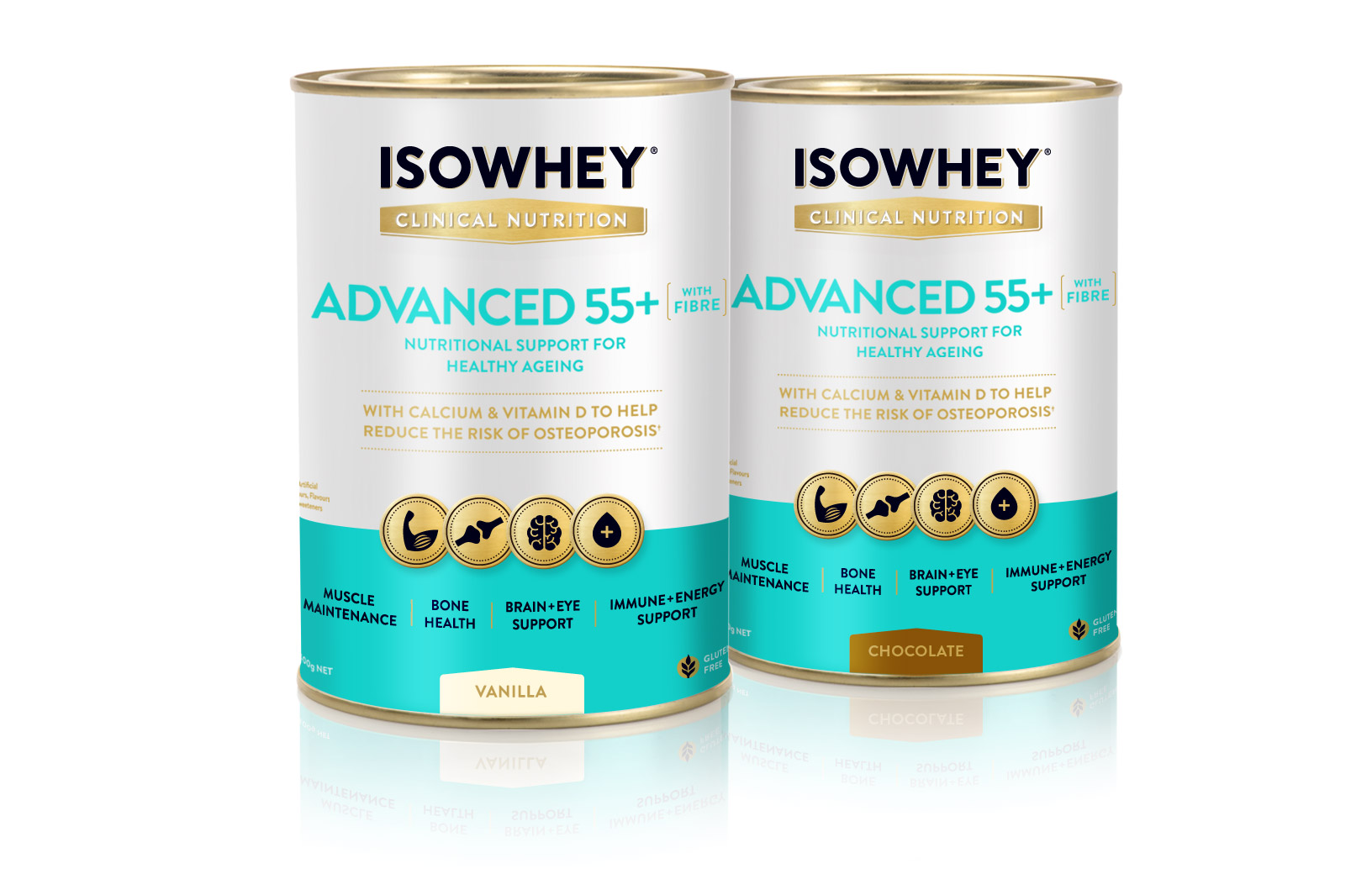
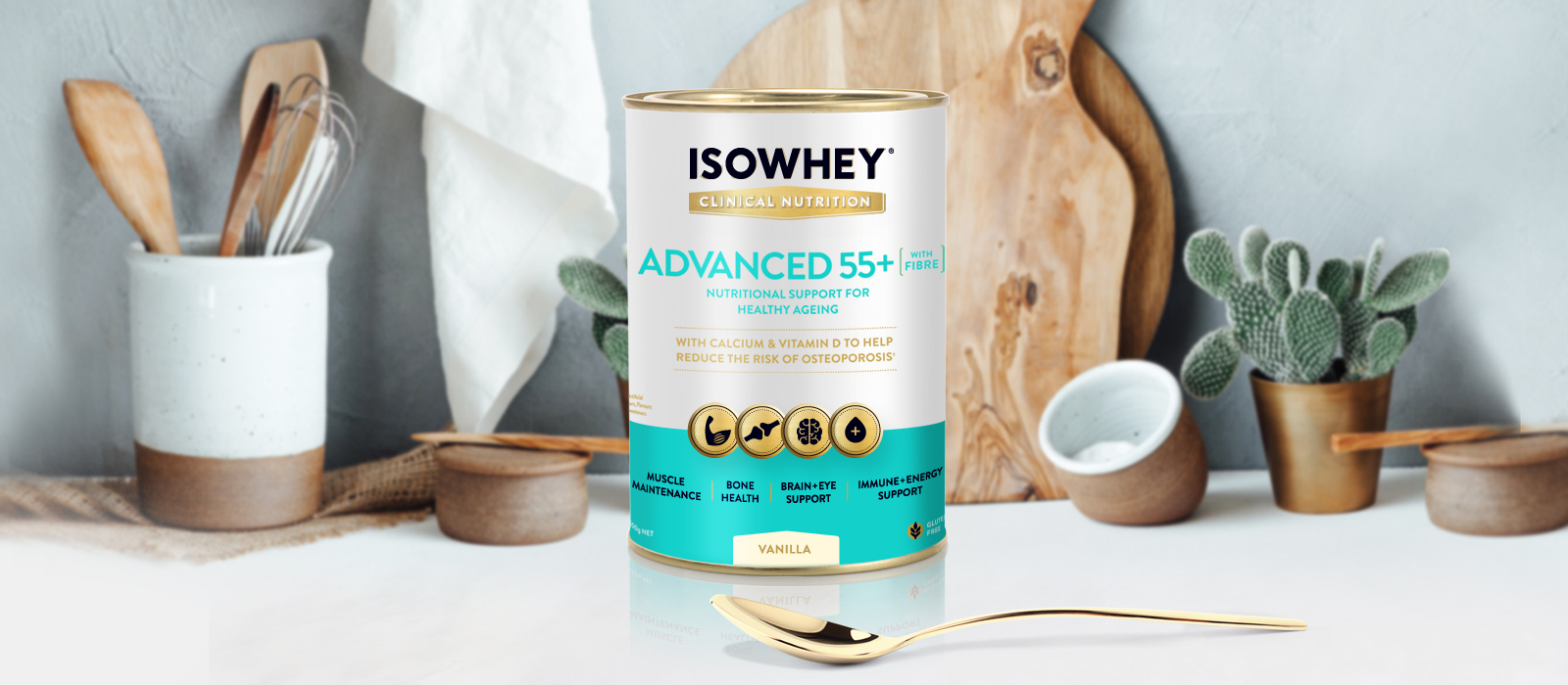
The introduction of new IsoWhey Clinical Nutrition Advanced 55+ provided a significant design challenge. First we needed to design a new sub-brand logo ‘Clinical Nutrition’ to sit under the ‘IsoWhey’ masterbrand. The introduction of gold into the logo helped to position the product as premium, whilst complementing the lid and base of the tin.
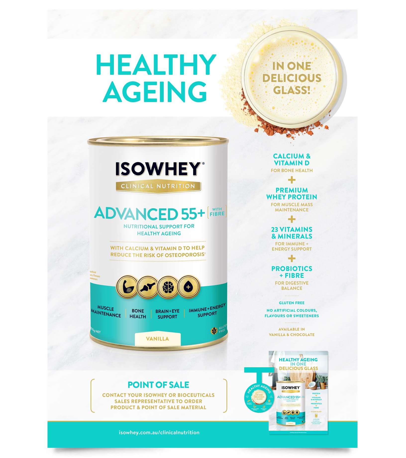
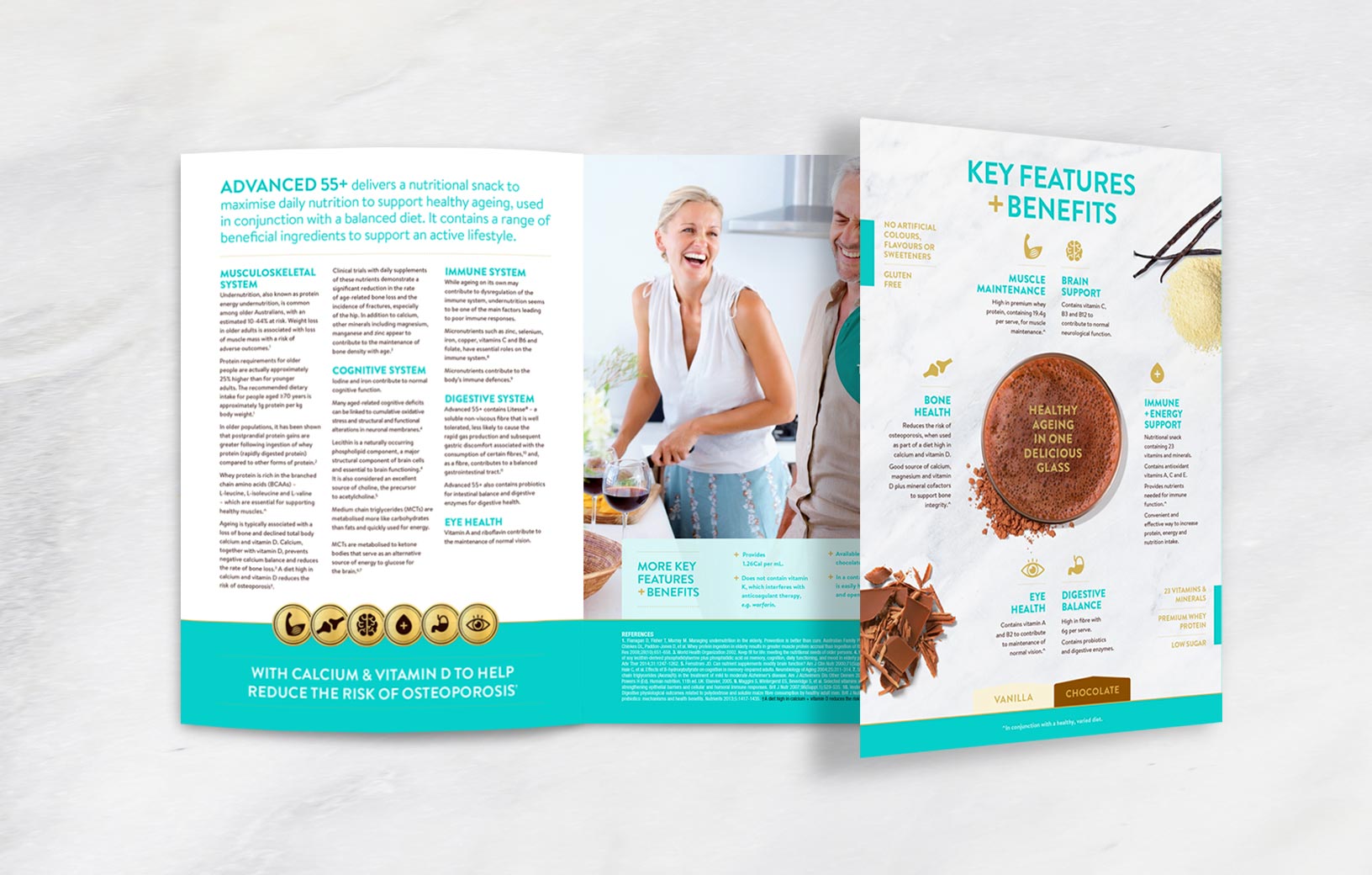
The attention to typography was critical, given the many messages we needed to deliver with clarity and appropriate hierarchy. The gold icons were developed to highlight the key product benefits and further support the premium positioning. Icons also feature on the back of pack and all gold areas are embellished with a spot gloss The white background of the pack supports the product’s clinical positioning, whilst the teal blue adds a clean and striking presence on shelf, differentiating it from key competitors.
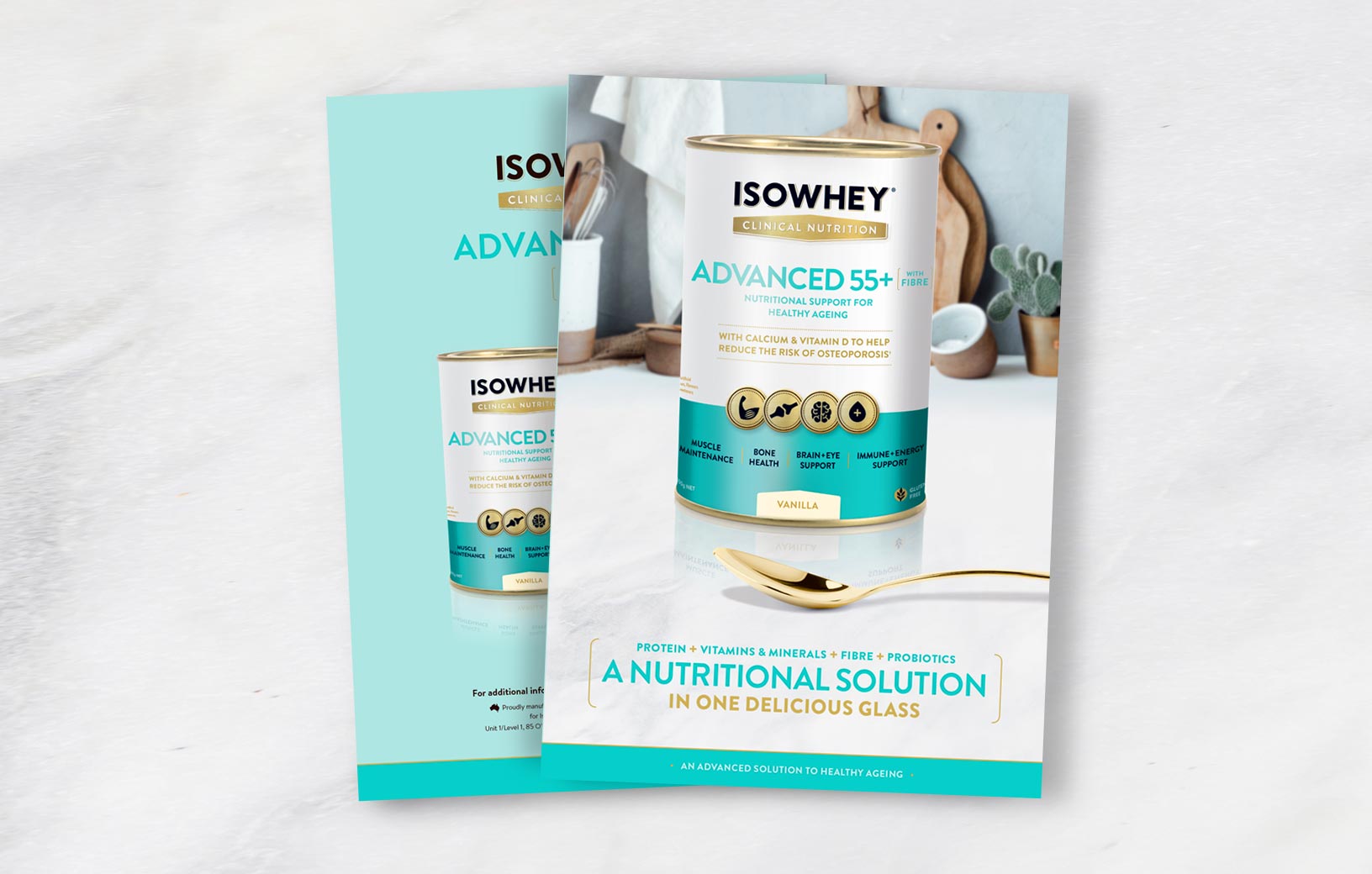
Our services included: Logo Design, Packaging, Copywriting Support, Iconography, POS, Trade Advertising and Print Production Management.
