Isowhey Wholefoods
Being passionate about brands, we were thrilled to be selected to develop a brand identity for new IsoWhey Wholefoods.
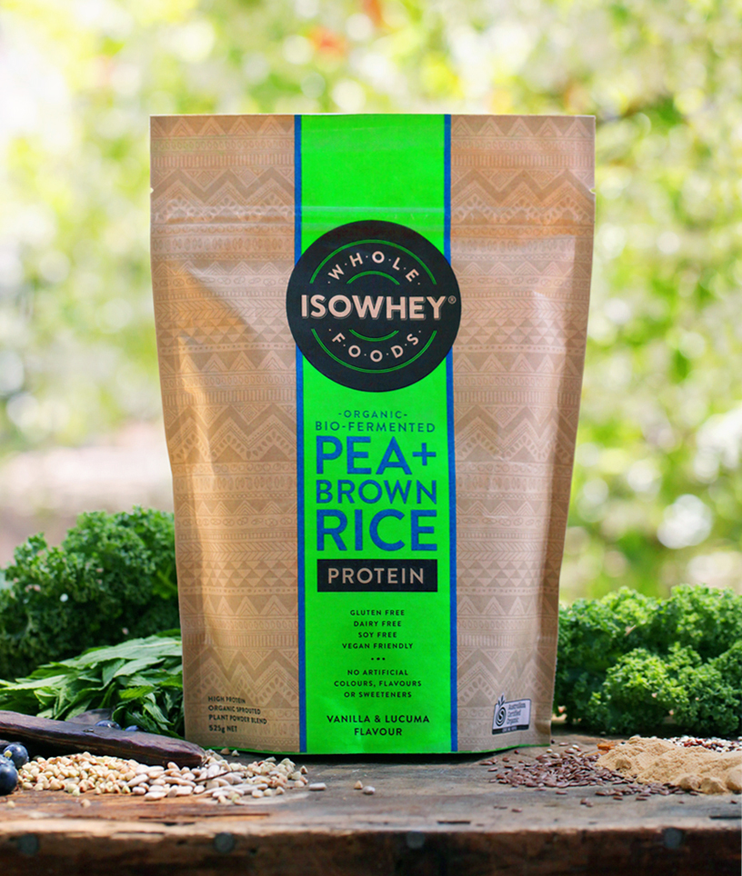
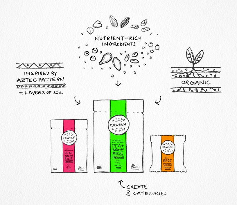
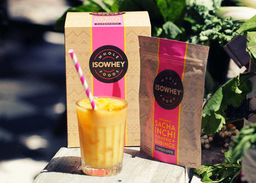
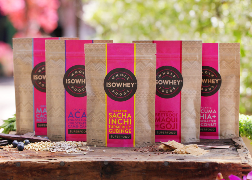
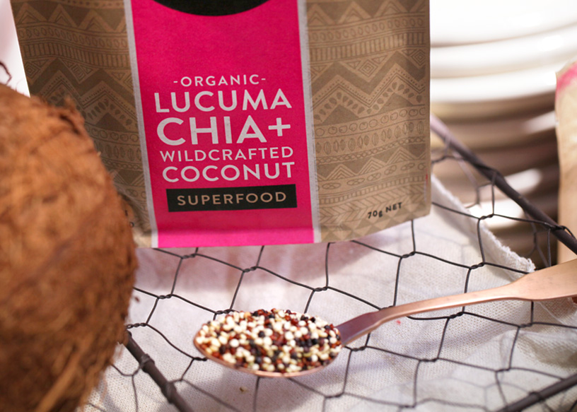
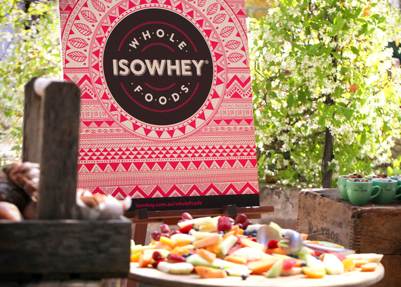
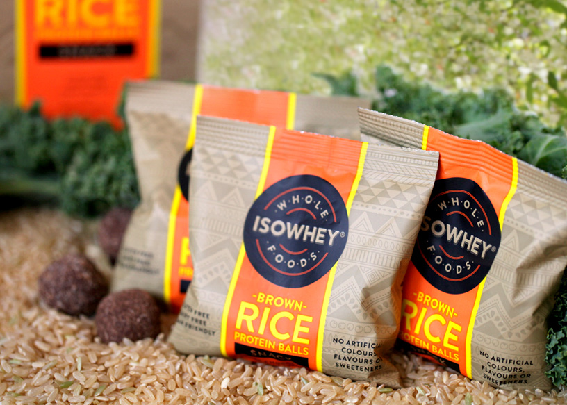
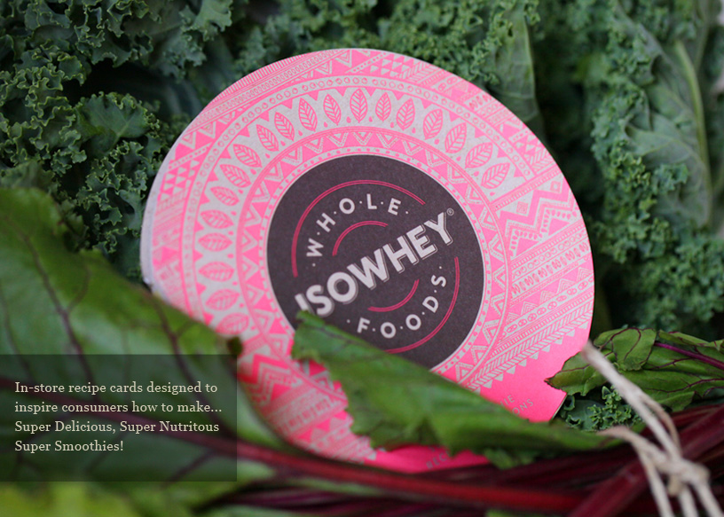
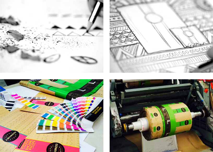
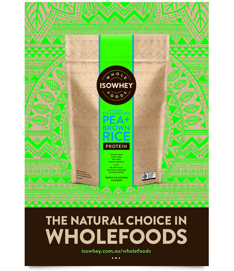
Our design was inspired by the nutrient-rich ingredients embodying wholefoods and began with the creation of an intricate hand drawn Aztec style design, symbolic of the link to natural products.
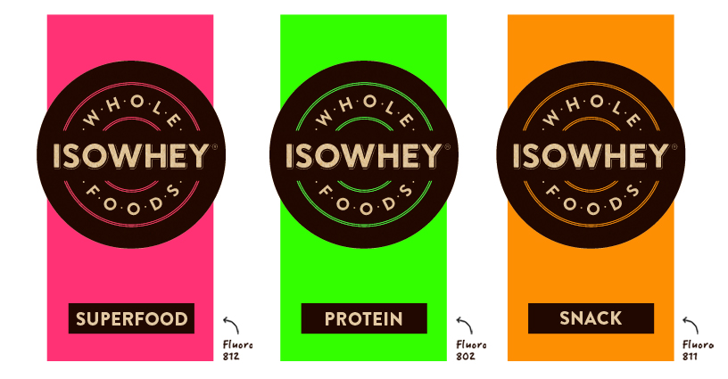
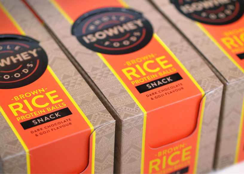
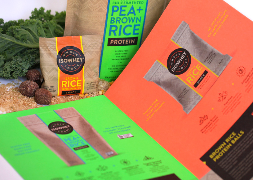
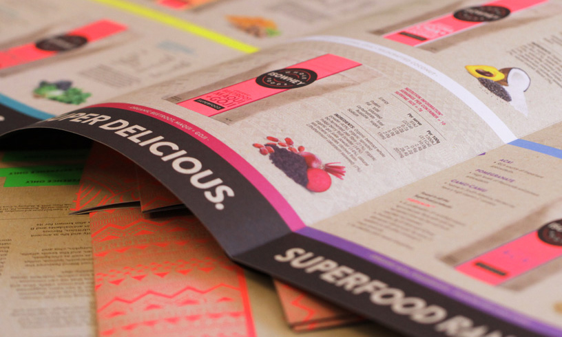
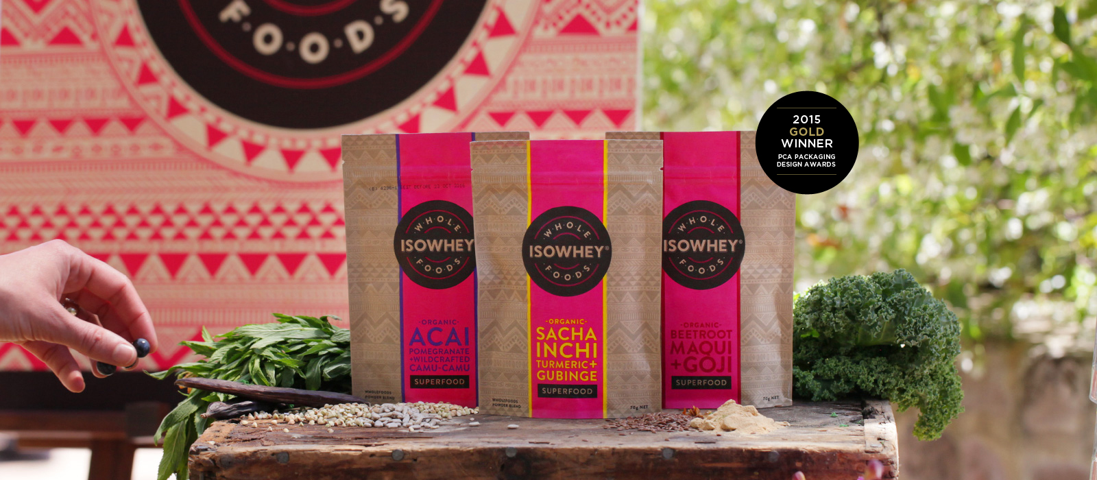
We then added a unique burst of vibrant fluro colour to each pack to add contemporariness and relevance to our target. The selection and use of these beautiful colours was used to segment the range into Protein, Superfoods and Snacks, creating a fresh and impactful range at shelf level.
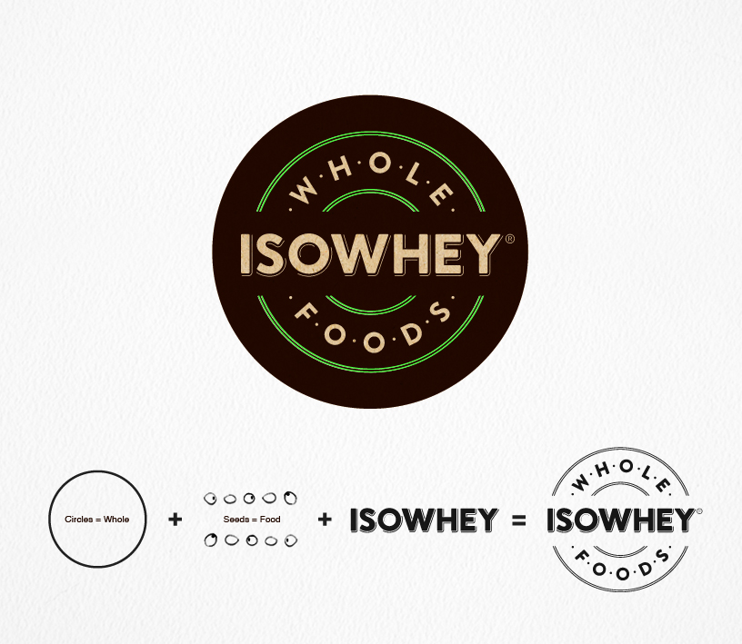
Our services included: Logo Design, Packaging Design, Colour Palette and Brand Guidelines, Illustrations and Iconography and Print Production Management and Press Approvals
The strength of our pack design has been noted as a key factor behind Priceline accepting the full range of IsoWhey Superfoods exclusively for 6 months before even sighting the finished product – a testament to this fresh and impactful packaging range. The full range has also met with overwhelming acceptance and positive support by the Trade and Health Practitioners nationally.
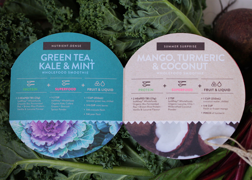
The strong use of the pack’s Aztec style illustration and fluro colours was applied across all supporting materials, providing strong branding and consistency plus achieving high level impact and visibility in-store.
